Motto: HTML Stands for “Hard To Make Look (Good)”
The column doesn’t format well. I’ve noticed consistently throughout the year that Blogger often introduces its own formatting decisions between the “edit” and “publish” phases of my column writing. This post employs an intentionally new typeface throughout. The headlines are Arial. The body Verdana. I used to use Droid Sans. It was a very Googly thing to do. Today I wrote some poetry. I used to write poetry fairly often, but I quit a while back. I thought I left poetry at the right time. Was it wrong not to write anymore? I wanted to fill a tall order in short bursts. When I was down with what was up, I differed being different to be similarly similar. Now I think a little bigger. That’s a poem. This is a short column. I hope the formatting looks the same after the publish as it does here in the editor. I don’t want to do all my columning in raw HTML. If it comes to that, I will do it, though. I hate consistent inconsistency in formatting.
Note from the future
see Aaron this is why you don’t write Columns about Columns at that time. They age poorly. If anyone is reading this HI HOW YA DOIN’?
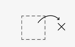
The picture I’m going out on is a recreation of a doodle I did a lot when I was going through that “finding myself” thing:

Outside the box.
Top 5: Blogger Frustrations
- The built-in video embedder not finding my videos on YouTube
- The lack of paragraphing options
- The old “your text now has a white background and is unreadable” issue
- Fonts changing mid-post without my permission or control
- In general, WYSINWYG (What You See Is NOT What You Get)
Quote:
“You’re the brat-wurst” Ben, this is only quote-worthy because I made a similar pun last week to deaf ears
