Motto: Purity is in the eye of the column writer
Last night I was looking through the column on my (old) Galaxy Nexus using the Google Currents app. Currents, if you don’t know, is a news/RSS reader that pulls text articles and pictures in from various websites. They are aggregated them and formatted in an easy-to-digest manner for mobile. Currents can be wonky at times, especially if the sites from which it pulls are not put together neatly on the back-end. Today marks the first column I’m writing with my new, more pure, more simple Column Starting Template. You may notice subtle changes between this column and the one below it. Then again, you may not. Either way, I’ll feel a lot better about it.
The next, and last, thing I’m going to write about is what came in the mail for me today while I was at work: My Nexus 4.
Let me set the scene for you.
I picked up my package from the front desk. Brought it to my room. Turned on only the lights that I needed to to see what I was doing. I turned on Ave Maria using Google Music. I slowly cleared a spot on my counter.
If I had candles, I would have lit them.
I opened the box. It was then my eyes saw the beauty. I just stared at it for probably several minutes. Only after soaking up all the goodness, did I pick it up. I spent the remainder of the song just turning the device over and over again in my hands again, appreciating the aesthetics. The texture. The color. The weight. The glimmer. The size. The details. After the song ended, I turned it on.
The entire rest of this column (down to the quote) is effectively a short comparative review of the Nexus 4.

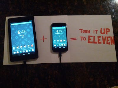
I had to a make two of these… and I still barely got the whole word “eleven” on there.
I love it.
It’s sleek. It feels great in the hand. The haptic feedback feels great when interacting with the device. The notification light is classier. The display’s white reproduction destroys that of the Galaxy Nexus. The camera performance is all-the-way-around much better (see the Top 5). The upgrades of 4.2 are all there (thanks to Verizon, they weren’t there on my GNex). I’ve only had the device for a few short hours, and I’m already in love.
I just escalated it from “I love you” to “I’m in love with you” status. That is a big jump.
Rendering a regular old panorama takes the Galaxy Nexus ~10 seconds. The Nexus 4 got it down in ~2. This was the first real dose of added speed that I could put my finger on… but not the last. The menus fly. Loading apps is instant. Everything is great.
The device feels so much more premium. No longer is the iPhone undeniably a better quality device by manufacturing standards… and that’s nice.
I’m not one for conspiracies, but: Nexus 4
- Nexus 7
- Nexus 10 = Nexus 21
Oh, wait, the movie 23 is about global conspiracies and mental insanity… the movie 21 is about the guy from Across the Universe being really good at blackjack. Nevermind. I’d delete all this, but it’s already been written and I’m too lazy.
Oh, and I got all my Christmas shopping done this weekend. I’m so ahead of the game. There was a full 2 weeks left.
Although Christmas will never come because The End of Ze World is coming December 21st. Stupid Mayans. That video in that link has foul language, by the way. It’s also really really dumb and not worth anyone’s time. Nevertheless, it’s internet famous.
I can’t write anymore. I want to go play with my new toy.
Yup.
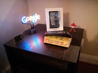
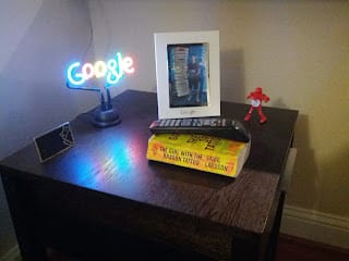
Top 5: Photo Comparisons Between the Galaxy Nexus (first picture) and Nexus 4 (second) 5. Sitting under a light


4.Sitting under a light, with flash


-
Google side table


-
Low-light performance one


-
Low-light performance two (the time difference between these shots was 6 seconds, I measured)


That last one is going to be my new G+ banner photo.
Quote:
“I’ve heard a couple guys and girls talk about that movie. All the guys have said it was bad. All the girls loved it.” AJ, about the movie “The Life of Pi”… it was bad (okay, not “bad”… just very much not my type of movie)
